Iticons:
abstract
and inclusive avatars for a payments app
Iti Itaú.
São Paulo, Brazil.
2020
Understanding
the context.
Iti is a digital bank and part of the product portfolio of the largest bank
in Latin America, Itaú.
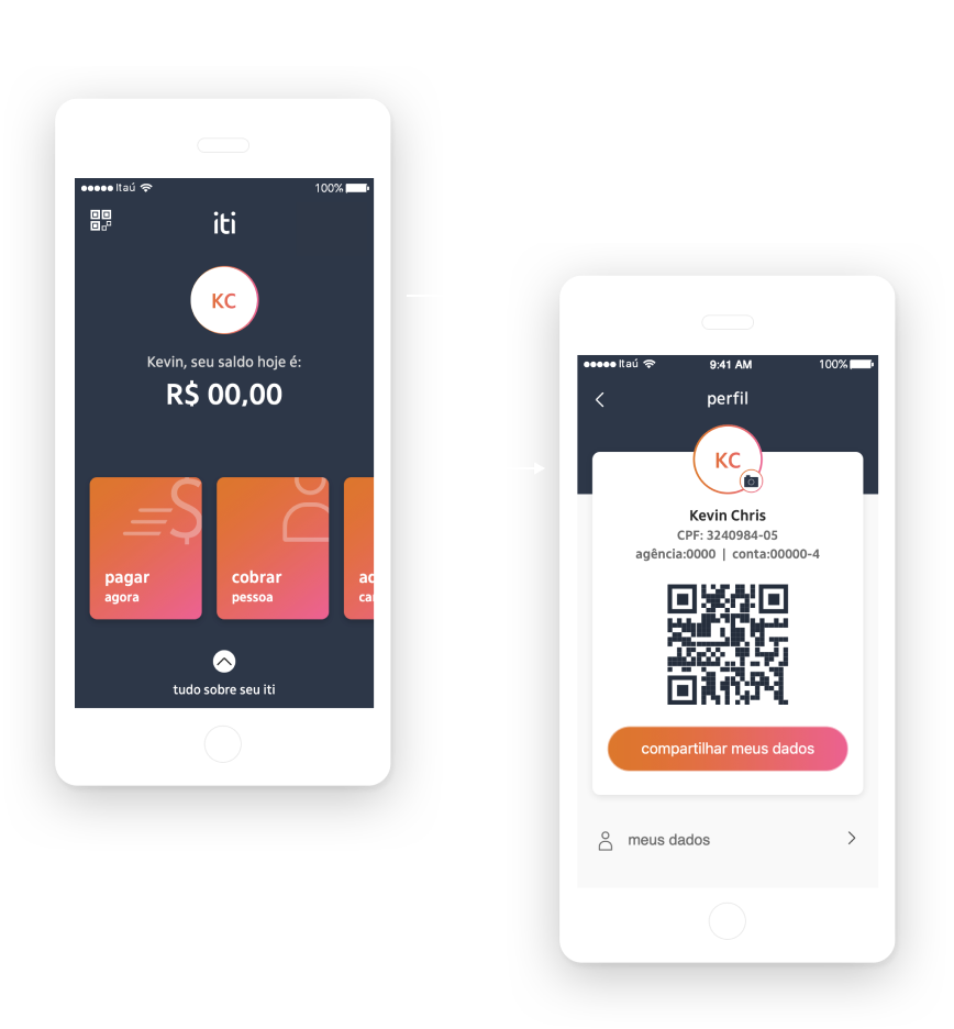
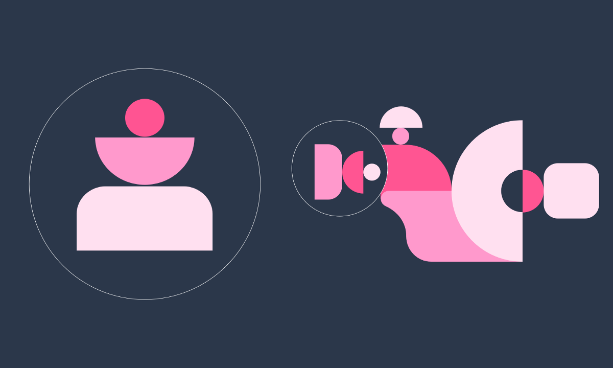
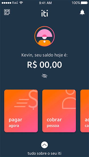
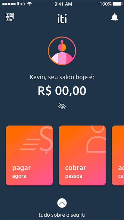
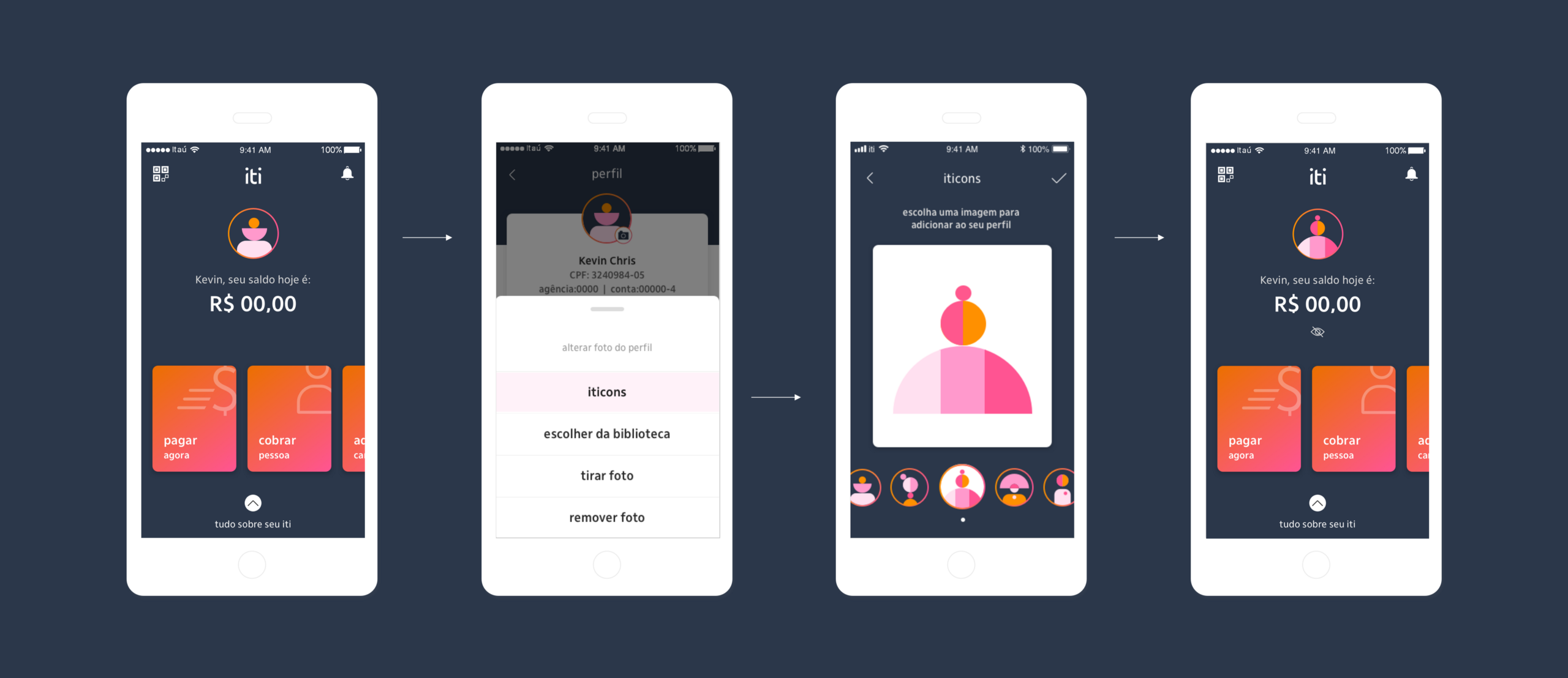
On the left, you can find the homescreen, where the user could see the total ammount in your account and right above, within this big circle with the user's initials it was the shortcut and only way to access the profile.
Crucial informations and features were located in the profile: account, personal settings, credit card acquisition, support, app security and delete application.
The problem
& the KRs.
Data showed us that, after onboarding, most users took a long time to click on the circle with the initials to find the profile. Besides, several complaints from customers to the support were related to finding information that were located in the profile.
So, it was not difficult to conclude that we needed to give more visibility to the
profile area. For solving that problem, we defined 3 KRs:
- increase in 20% the number of clicks to the profile area
- reduce in 30% complains in call center about getting information
- increase in 10% the number of credit card registration
via profile
Solution hypothesis.
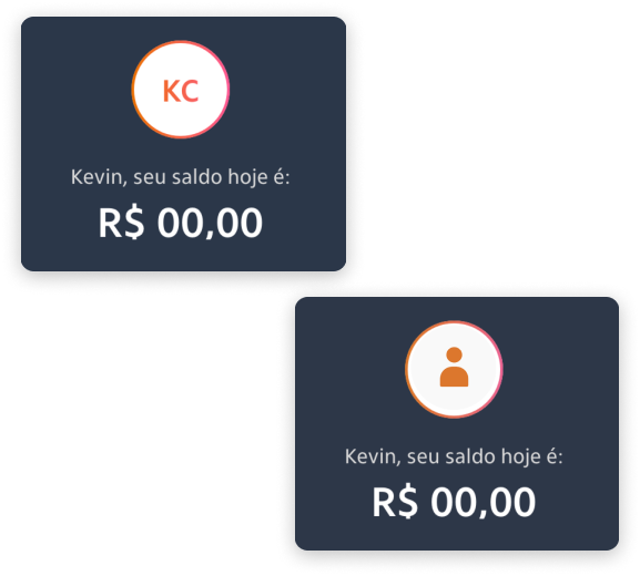
Our initial solution hypothesis was that if we exchanged the initials
of the name for a silhouette, it would be clearer to the user that
the circle was a shortcut to the profile area.
However, some things bothered us about this hypothesis. At first
I thought it was a very trivial path, a lazy solution, because you just had
to take the icon from our library and put it there, right?
One of the things I learned throughout many years working
in advertising agencies, where you know and work with many talents
in the creative market and also with super critical design leaders, is that we must never be satisfied with the first solution, we always need to ask ourselves if what we are delivering is good enough, if it can’t improve,
if it can’t be different.
Creative
Process.
Two universes inhabit us human beings: a real and an imaginary. The visual of iti,
created by the designer Gustavo Borges, represents these two universes: on the one hand, representational illustrations that brings people and concrete objects from “real” and apparent life and on the other side, geometric and abstract shapes that represent our immaterial, imaginary and creative world.
In all iti communication, graphics are extensively explored. But we still needed to bring them into the application and give them a function. Analyzing the graphics calmly,
it is possible to see or associate the geometric shapes forming human figures.
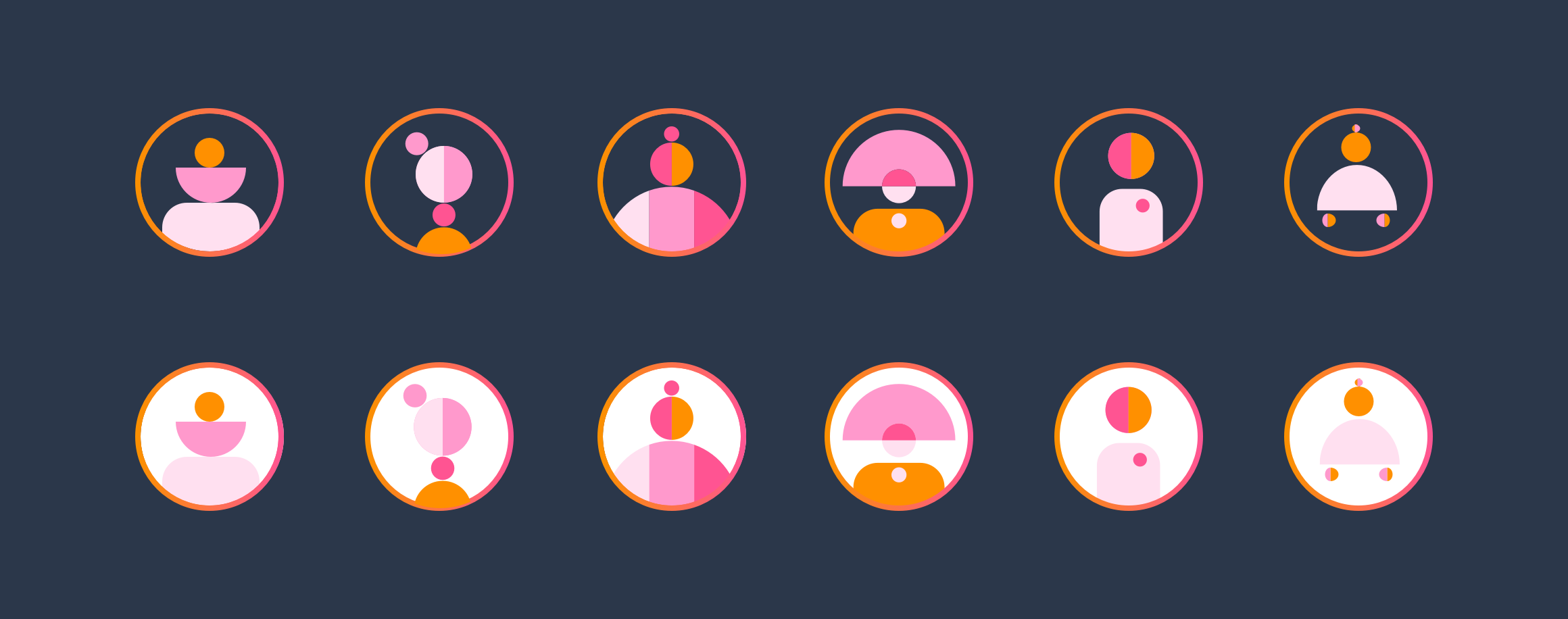
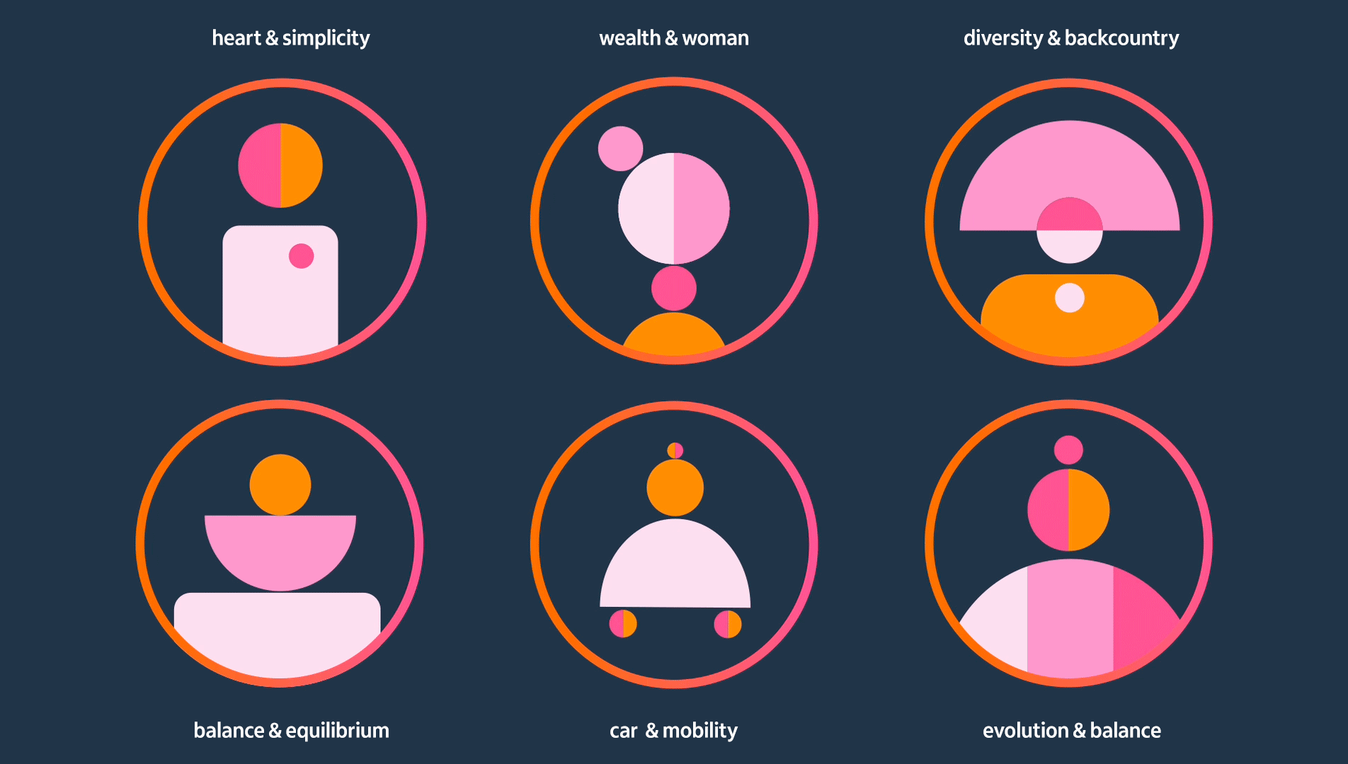
And that was where the idea to create our avatars for the profile photo was born: from the geometric shapes of our graphics.
iti illustrations — representational figurative images. Our real and concrete world.
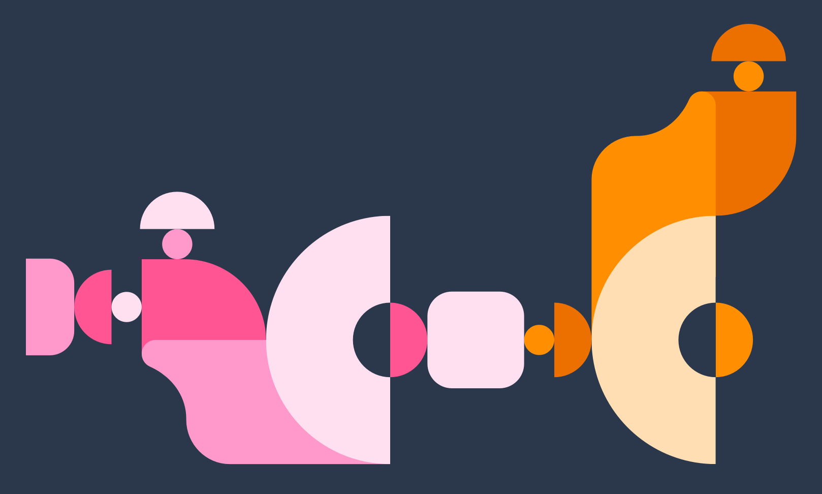
iti graphics — non-representational geometric shapes. Our inner and imaginary world.
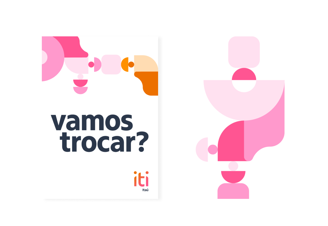
- This was the first avatar extracted from the branding, done at the time by Borges.
So, the
iticons were born.

and we gave
them personality with motion
I suggested we affectionately call them iticons -> iti + cons (emoticons)  because I thought it would bring a more proprietary tone if they carried a part of iti in their name than just calling them avatars. Thus, we create forms of abstract identity representations from the geometric shapes of our branding.
Our objective was to build figures that resembled human silhouettes but
more free of real characteristics, colorful and abstract so they could stimulate
the creativity of each user and also give them the freedom to be whoever they
want and give the meaning they wanted to the representation.
App
experience.
.
.
The flow.
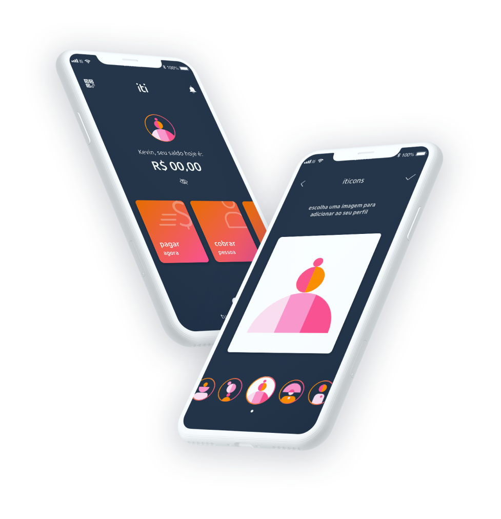
Now is time to explain a bit the app experience. We thought on a simple flow which the iticon would appear in the app as the default profile icon from the first user’s access to the app and stay there until they chose to put a different picture or another iticon in place.
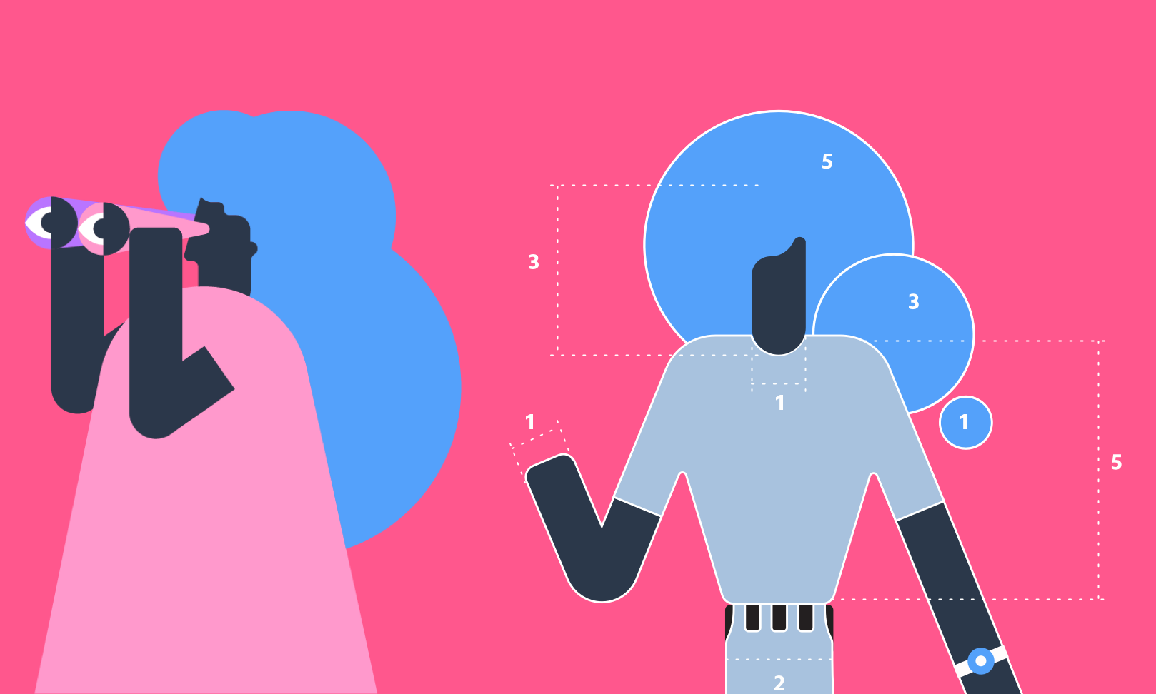
On the right side, you can see how the iticons were applied in the homescreen, replacing the white circle with the letters. We also implemented the iticons with animation, very well crafted by the designer Lucas Mayer. Our bet was that without being static, it would catch much more the users attention :)
User
Research.
Before handing over to development, we did a combined research (qualitative
+ quantitative) in our research lab and also on an online forum to understand whether, for our customers and non-customers, iticons generated some kind of engagement, reaction, emotion or identification and also to find out which ones were their favorites.
We did the research with an audience of both customers and non-customers of iti,
aged between 25 and 45 years old: 6 people via lab and 38 people online from different regions of Brazil, Southeast, Northeast, South and Midwest via an online forum.
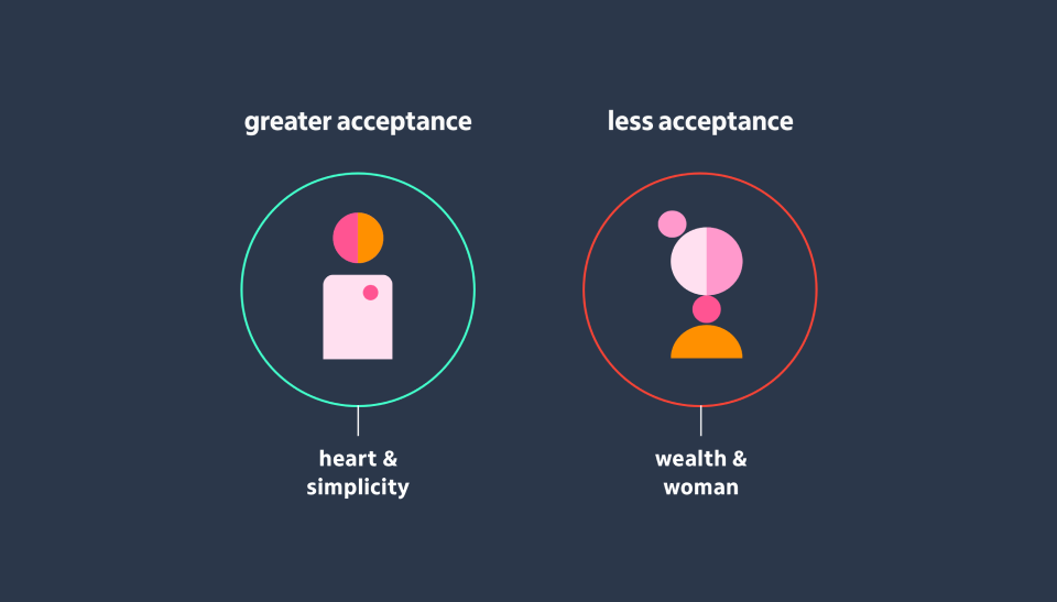
With the qualitative research we captured some spontaneous associations of the participants in relation to those images in a context of use in the app, because the first reaction of people when they encounter new visual stimuli is to start trying to decode them and then give them a sense and meaning (Gestalt Psychology).
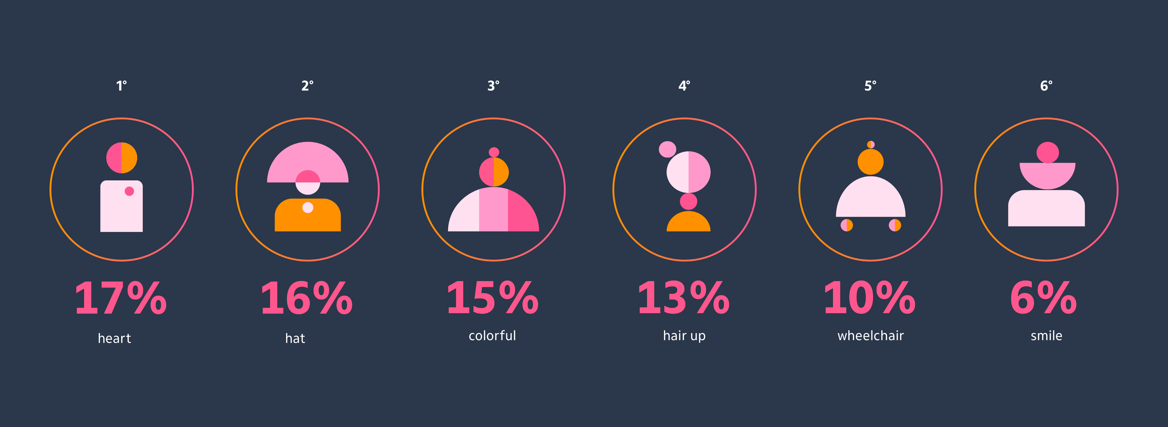
In quantitative research, we could capture users’ iticons preferences. We also asked if they would prefer use the avatars instead of using their own pictures: 60% said they would use iticons because they like them :)
The words diversity, affection, balance, organization and agility came up again and again during the qualitative research. The main associations have a lot to do with the context of using iticons, addressing the needs that users have to manage their own money. It was nice to notice the strong presence of the word diversity, as it reinforces the democratic character that we have as the value of iti.
Inclusion
& acessibility.
Blind people
are tactile.
The possibility of access by blind people to communication via image in tactile form is still a little used resource.
This is a big loss for the blind, since the lack of access to graphic materials (drawings and figures) restricts a wide possibility of knowledge of the world and further excludes the visually impaired.
We needed to create accessibility specifications, after all, the product is for everyone. But how would we describe these characters to people who were visually impaired?

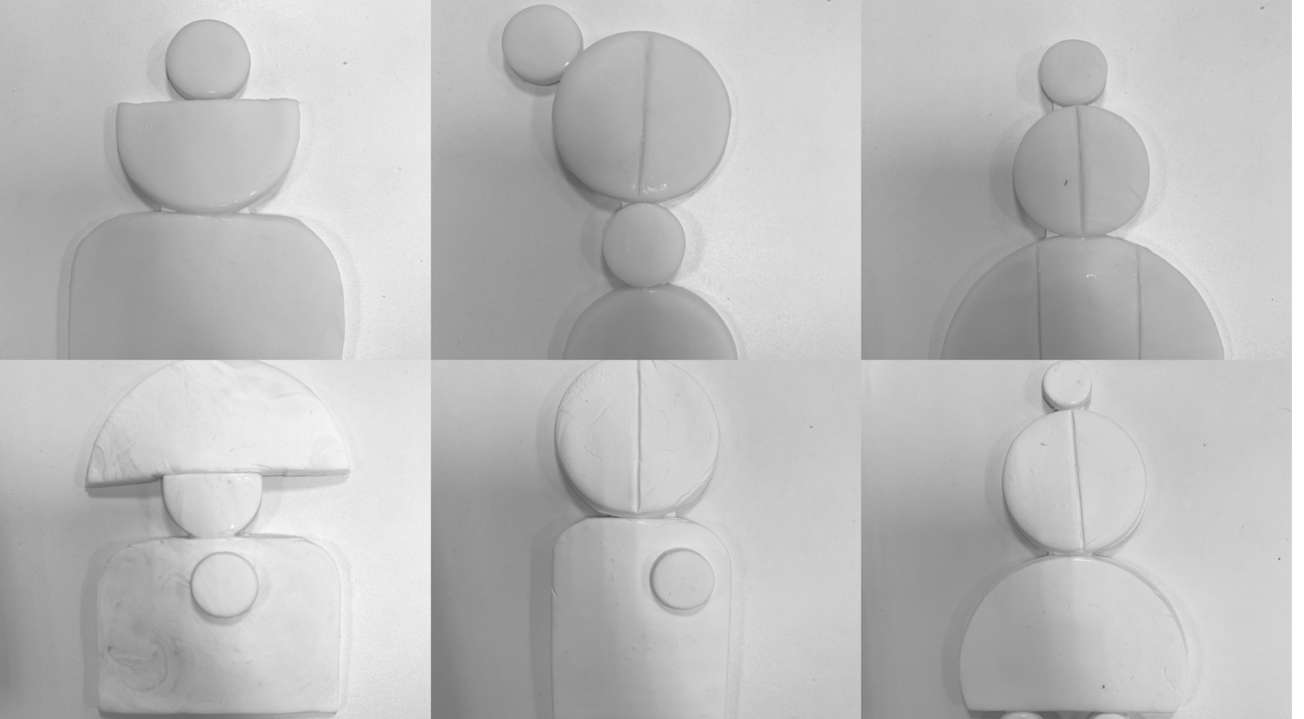
Plastic Ceramic iticons.
We needed to create accessibility specifications, after all, the product is for everyone. We had the idea of bringing iticons into “life”, so in that way, the blind and people with low vision could perceive, in their way, our avatars.
Methodology .
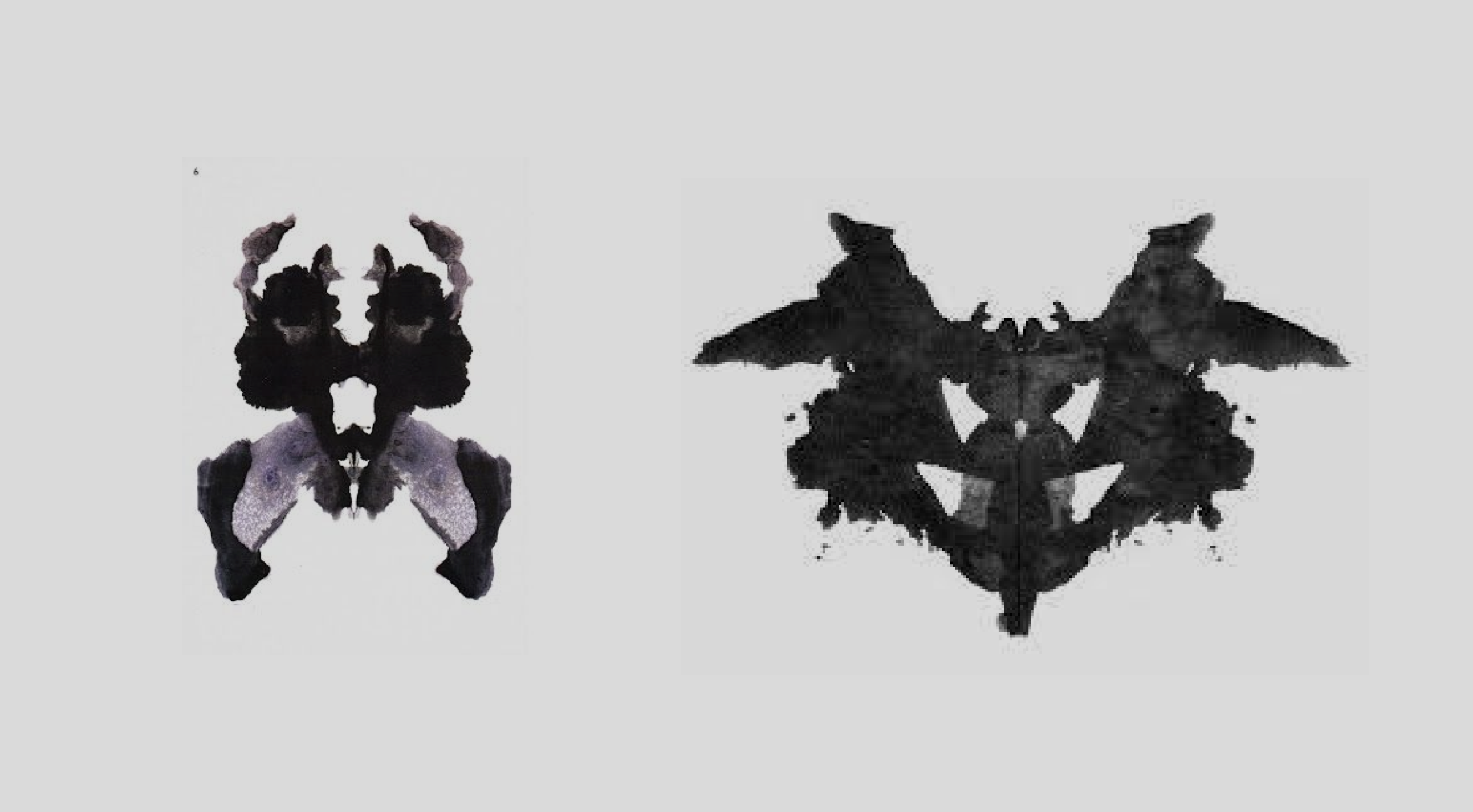
Knowing this, we used the Rorschach test, which is a method of self-expression. The test consists in giving answers about what the paint stains look like. The same images are shown to the group to obtain impressions about them and thus gather information about the participants' emotional character.
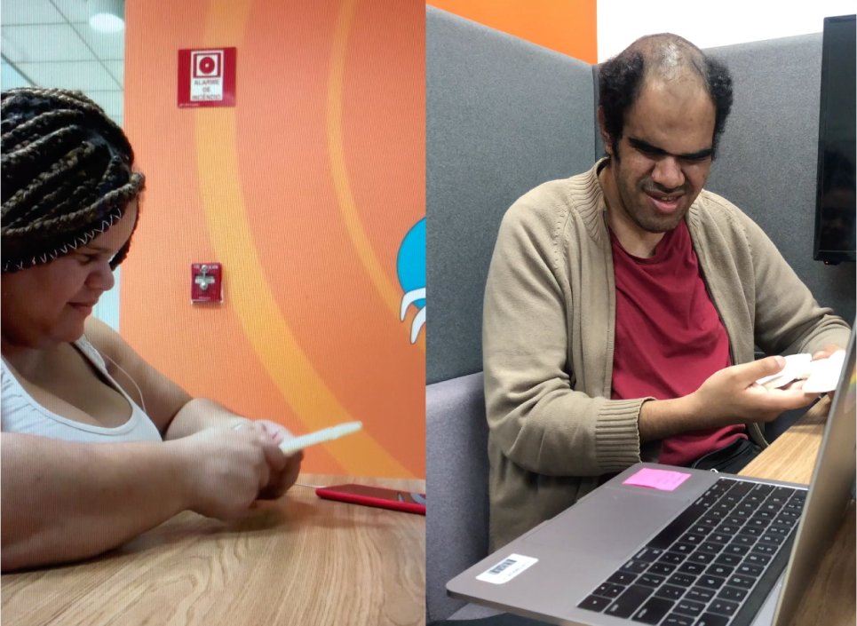
Testing with
blind people.
We did the test with 3 blind people from birth, 1 with acquired blindness and 2
with partial blindness. The test consisted of handing the ceramic iticons and then
4 questions were asked:
1. comprehensive description of what was being felt
2. description of the part that drew the most attention
3. assimilation with forms, feelings or people / characters
succinct description
All participants were part of iti team. They were very happy to be invited to participate
on the creation of the description of the visual components of the application, and not only in the validation of accessibility, as it happens on the majority of the time. It was
a great lesson for everyone involved in the development of this feature  We learned
a lot from everything!

Test
Results.
We understood that the iticons must not stimulate the creativity only for those who has perfect vision, but for everyone. To build the accessibility description together with them, made us understand that just one word was necessary to describe them, because the other cognitive senses came with the creativity of each person that is listening to the description.
Learnings &
business impact.

business impact
+20%
profile access
-18%
complains at Support
+10%
Credit Card acquisition via profile
In addition to all the incredible experience we had creating the iticons and sharing the experience with our blind colleagues making them inclusive, we had good results in the implementation and public acceptance.
It was a great surprise to learn that from all the users who accessed the “change profile picture” flow, 77% chose to keep the iticon or choose another one that caused them greater emotion. The other 23% choose to put a picture from the library or take a picture with the camera.